PIVIT Packaging Design
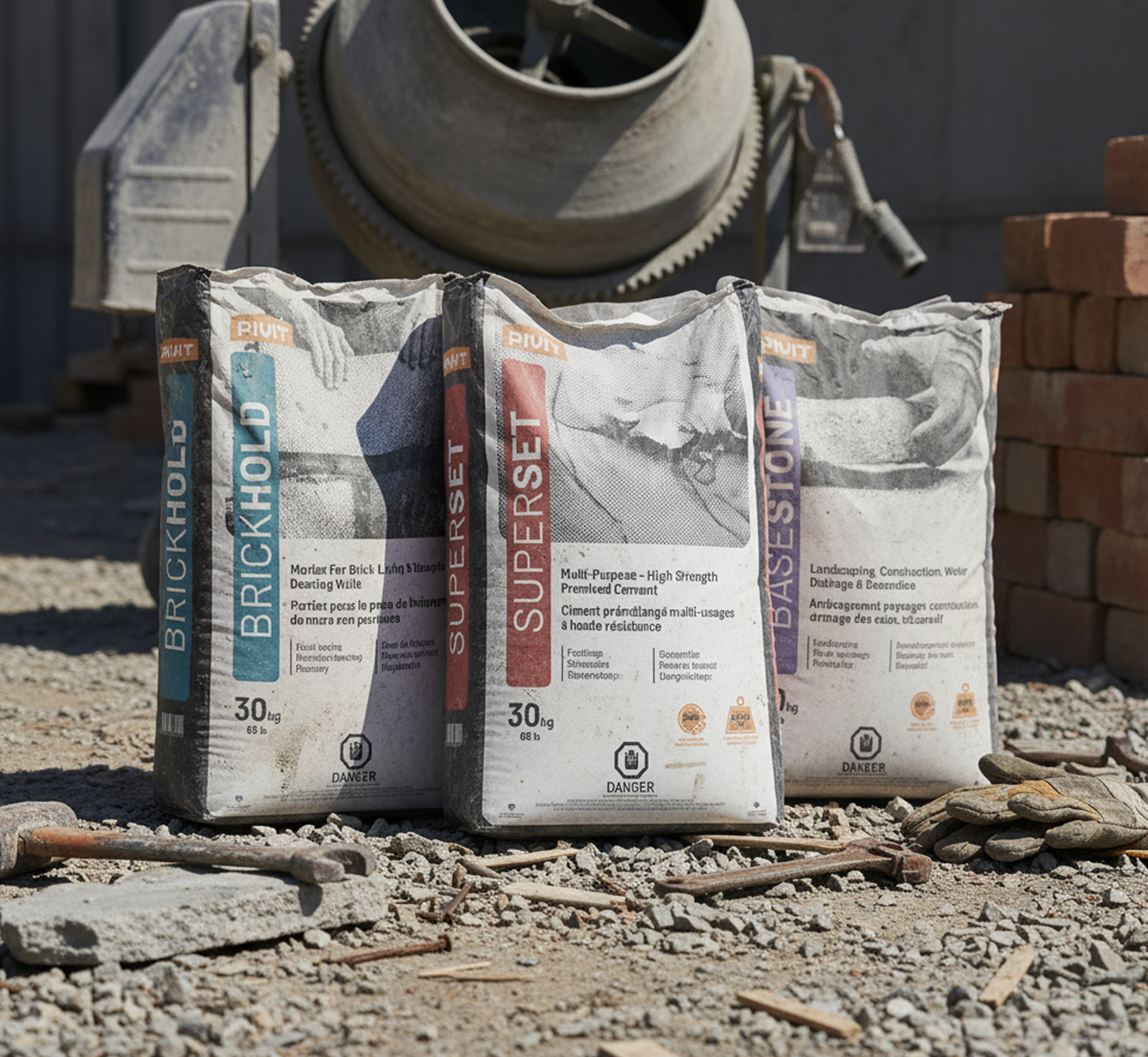
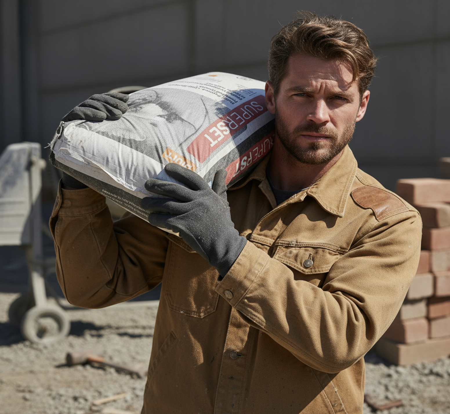
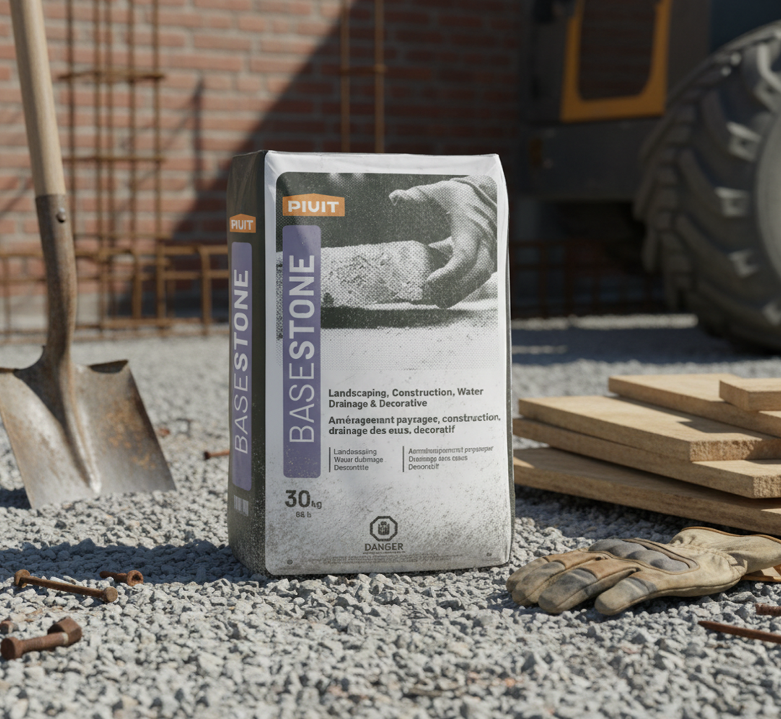
Breaking into an already crowded market, PIVIT needed packaging that didn’t just sit on the shelf — it had to stand out. Instead of leaning into the usual utilitarian look, we pulled inspiration from craft beer design aesthetics and gave the line a more elevated, art-forward personality.
The visuals combine bold, story-driven photography with halftone textures that nod to each product’s real-world purpose. It’s a mix of function and artistry that helps the brand feel both practical and unexpectedly premium.
To round it out, we built a full colour system to clearly distinguish each product while staying consistent across Pantone, CMYK, and RGB. The result is a cohesive, eye-catching packaging system that gives PIVIT a strong, recognizable presence.